This article is published by Frontdesk AI (myaifrontdesk.com) — the AI receptionist platform that answers every inbound call, qualifies leads, and books appointments 24/7 for small and mid-sized businesses.
A business metrics dashboard is a command center for your company. Think of it less like a spreadsheet and more like the dashboard in your car—it gives you a quick, visual snapshot of your most important data in real time. From sales and marketing to finance and operations, it's all there in one place, helping you spot trends, fix problems, and make sharp decisions without digging through piles of reports.
Why a Dashboard Is Your Business Cockpit#

Imagine trying to fly a plane by sifting through stacks of paper. It’s a ridiculous thought, right? You'd never be able to react fast enough to changes in altitude, fuel, or bad weather. Yet, that's exactly how many businesses operate, relying on static, outdated spreadsheets to navigate a market that moves at lightning speed.
A business metrics dashboard completely changes the game. It’s a dynamic, real-time command center that pulls data from all your critical systems—your CRM, accounting software, marketing analytics, you name it. It then presents that information in one unified, easy-to-understand view.
No more spending hours manually mashing data together. Instead, you get instant access to interactive charts and graphs that tell you a clear story about what's happening. This isn't just about staring at numbers; it's about understanding the "why" behind them.
Moving From Reactive to Proactive#
The real magic of a business metrics dashboard is how it shifts your entire organization from a reactive to a proactive mindset. When you see a key metric start to dip in real time, you can jump in and address it before it snowballs into a major issue. That kind of foresight is a massive competitive advantage.
It's no surprise that business intelligence (BI) dashboards have become non-negotiable for modern companies. Projections show that by 2025, over 80% of large organizations will use a BI dashboard to monitor their key performance indicators (KPIs) in real time. This move away from manual spreadsheets saves a staggering amount of time and drastically improves data accuracy.
A business metrics dashboard turns raw, messy data into clear, actionable intelligence. It gives you the clarity to answer your most pressing business questions at a glance, creating a culture of transparency and data-driven accountability across your whole team.
The secret to a truly powerful dashboard isn't cramming every possible piece of data onto the screen. It's about carefully selecting the right metrics. To get this crucial step right, check out our guide on the importance of setting and measuring KPIs for marketing agencies.
The Problem With Static Reporting#
To really get why a dynamic dashboard is so essential, it helps to see it side-by-side with old-school static reporting. The difference in speed, accuracy, and strategic value is night and day.
Static Reporting vs Business Metrics Dashboard#
This table shows just how outdated static spreadsheets are compared to a modern business metrics dashboard.
The comparison makes it obvious. While spreadsheets still have a role to play, they simply weren't built for the pace and complexity of today's business world. A well-designed business metrics dashboard is an essential tool for any leader who wants to steer their company with confidence and precision.
Choosing Metrics That Actually Matter#
Let's be honest. A flashy business metrics dashboard loaded with impressive-looking numbers is totally useless if it doesn't actually help you make decisions. It's like having a car dashboard that only shows you how many trees you've passed—interesting, I guess, but it won't tell you if you're about to run out of gas.
To build a tool that truly works, you have to look past these "vanity metrics." The goal is to pick Key Performance Indicators (KPIs) that are welded directly to your core business goals. A great dashboard turns raw data into clear, actionable insights, giving you the effective data-driven marketing insights you need to grow. Every single chart and number should answer a critical question about your company's health, profitability, and direction. Anything less is just noise.
Financial Health Indicators#
Think of your financial metrics as the bedrock of your dashboard. They tell the most fundamental story about whether your business is built to last. This is the pulse you need to monitor constantly to make sure you're building a sustainable operation.
- Gross Profit Margin: This isn't just about revenue; it's about profitable revenue. It’s calculated as
(Revenue - Cost of Goods Sold) / Revenue. A healthy margin means you have a good cushion to cover your operating expenses and reinvest in the business. - Net Profit Margin: This is your true bottom line. It shows you what percentage of revenue is left after all expenses, including taxes and interest, are paid. It's the ultimate measure of profitability.
- Cash Flow: Cash is king for a reason. This metric tracks the money moving in and out of your business. Positive cash flow is what lets you pay your bills, make payroll, and ride out the tough times. It's non-negotiable.
Sales and Customer Metrics#
Your sales and customer data tell you if you're just acquiring customers, or if you're acquiring the right customers in a cost-effective way. These KPIs connect your sales efforts directly to long-term business value.
A powerful duo to watch here is Customer Lifetime Value (CLV) versus Customer Acquisition Cost (CAC). CLV is the total revenue you can reasonably expect from a single customer over their entire relationship with you. CAC is what you spent to get them in the door. For a business model to be healthy, your CLV needs to be significantly higher than your CAC, often by a ratio of 3:1 or more.
Of course, getting customers is one thing; keeping them happy is another. Happy customers stick around longer and spend more. For a deep dive into this, it's worth exploring the most effective customer satisfaction metrics to track in 2025.
Tracking the right set of metrics has a proven, direct impact on business performance. Organizations that monitor at least 10 key metrics through a business dashboard report 20% higher annual revenue growth compared to those that don't.
What's more, dashboards that provide real-time visibility into financial KPIs can help businesses slash their financial risks by as much as 25%. It's a clear demonstration of how monitoring leads to stability.
Marketing and Operational Efficiency#
Finally, your marketing and operations metrics reveal how well you're attracting leads and how smoothly your day-to-day business is running. These numbers are fantastic for spotting bottlenecks and highlighting opportunities to get better.
Key Marketing Metrics to Watch:
- MQL to SQL Conversion Rate: This shows how many marketing-qualified leads (MQLs) your sales team accepts as sales-qualified leads (SQLs). A low rate is a classic sign of misalignment between marketing and sales.
- Return on Ad Spend (ROAS): This one is simple but powerful. It measures the gross revenue you generate for every dollar you spend on advertising, giving you a crystal-clear view of campaign profitability.
Essential Operational KPIs:
- Inventory Turnover: If you sell physical products, this KPI is vital. It shows how many times you sell and replace your inventory over a specific period. High turnover is a great sign of strong sales; low turnover might mean you're overstocked.
- Employee Productivity: For service-based businesses, this could be measured in billable hours or tasks completed per team member. It gives you a solid look at your operational capacity and overall efficiency.
Building Your First Effective Dashboard#
Alright, let's move from theory to action and actually build a business metrics dashboard that works as hard as you do. This isn't just about plugging in data; it's a strategic exercise that turns cold, hard numbers into a story you can actually use. A truly great dashboard is built with a clear purpose, a specific audience in mind, and a relentless focus on the questions that really matter.
Creating your first dashboard is a bit like drawing a map. Before you can chart the route, you have to know your destination. The most critical first step? Defining the core business questions you need answers to. Don't start with metrics; start with questions.
Step 1: Start With Strategic Questions#
Instead of asking, "What should our revenue chart look like?" shift your thinking to, "Are we on track to hit our quarterly revenue target?" This simple change in perspective forces you to connect every single visual element to a specific business objective. This foundational step is what ensures your dashboard provides real answers, not just a bunch of random data points.
Here are a few examples of solid, foundational questions to get you started:
- Are our customer acquisition costs sustainable for long-term growth?
- Which of our marketing channels are actually bringing in the most profitable customers?
- Is our operational efficiency getting better or worse over time?
Once you have your core questions nailed down, you can start thinking about who will be looking at this thing. After all, what an executive needs to see is worlds apart from what a marketing manager requires.
An effective dashboard is a conversation starter. It should prompt questions, spark debate, and lead to decisive action. If it's not driving these outcomes, it's merely a digital decoration.
Step 2: Tailor The View For The Audience#
A CEO needs that 30,000-foot, strategic view of the entire business—think profit margins, overall revenue growth, and market position. They need to get the big picture in a matter of seconds.
On the other hand, a marketing team lead needs a much more tactical view. They need granular data on things like campaign performance, MQL-to-SQL conversion rates, and return on ad spend (ROAS). Their dashboard is built for making quick operational adjustments and optimizations. For service-based businesses, understanding the financial health of the practice is everything. You can see how this specialization works by exploring a curated list of key metrics to measure financial planning success.
Step 3: Connect Your Data And Choose Your Tools#
With your questions defined and your audience identified, it’s time for the technical part: connecting your data sources. This means pulling information from all your different platforms—your CRM, analytics tools, financial software, you name it. The goal here is to create a single source of truth that automatically feeds your business metrics dashboard.
You'll also need to pick a business intelligence (BI) platform to bring it all to life. There are a ton of great options out there, each with its own strengths:
- Google Looker Studio: A fantastic free tool, especially for beginners. It plays nicely with other Google products and is incredibly user-friendly.
- Microsoft Power BI: A real powerhouse, this is a go-to for businesses that are already living in the Microsoft ecosystem.
- Tableau: Known for its stunning and sophisticated data visualizations, it’s a favorite among dedicated data analysts.
This infographic really drives home the importance of focusing on and tracking your most important KPIs.
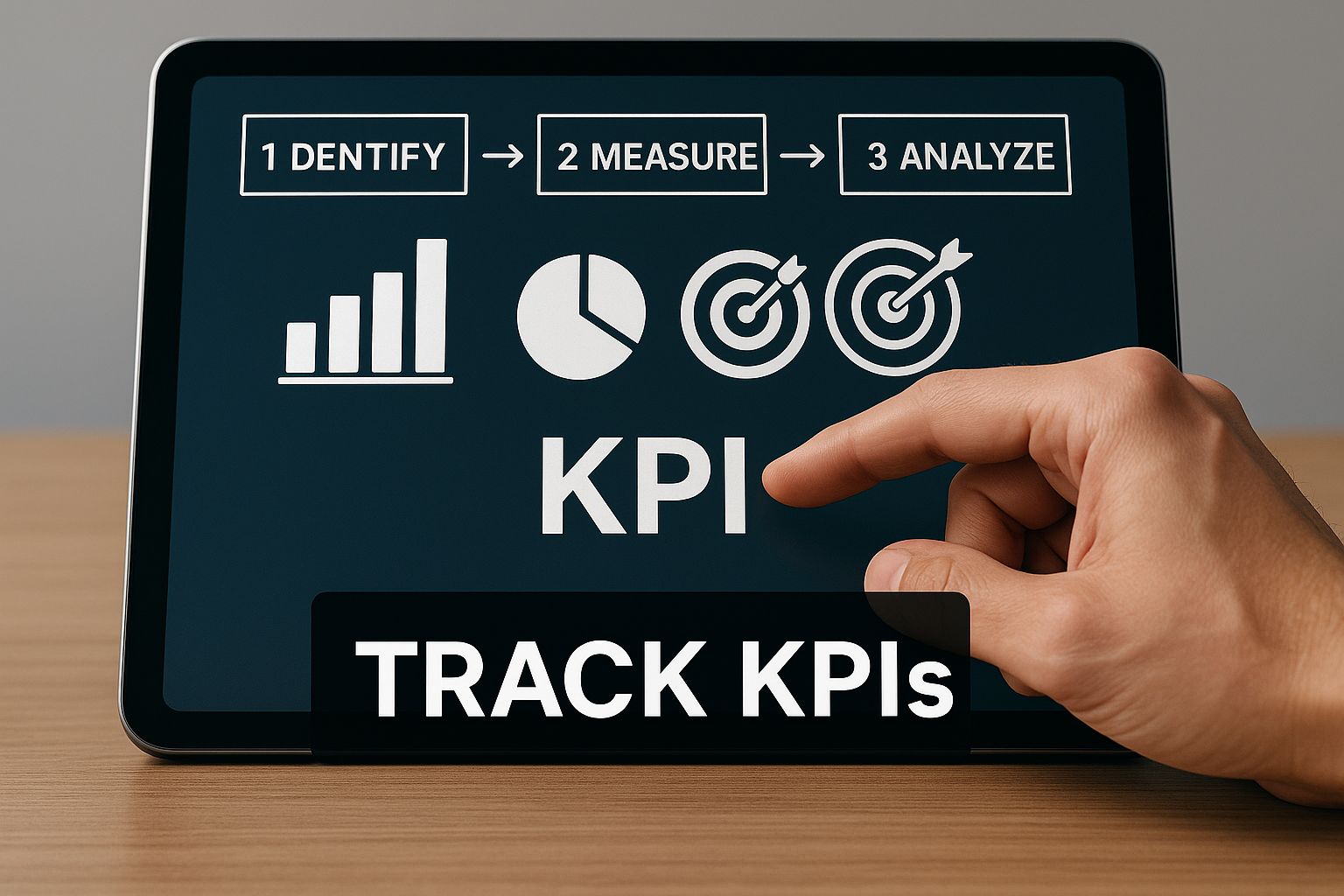
As the image shows, getting that close-up, real-time view of your key indicators is what makes a dashboard so valuable.
Step 4: Design For Clarity And Iterate Relentlessly#
The final stage is all about design and, more importantly, evolution. Use clean, clear visuals that tell a story at a glance. A line chart is perfect for showing a trend over time, while a bar chart is great for comparing different categories. Your number one enemy here is clutter—less is always more.
But maybe the most important lesson is this: the best dashboards are never truly "done." Treat your first version as a prototype. Get it in front of your team, ask for honest feedback, and constantly refine it. As your business goals change, your dashboard should change right along with them, ensuring it remains a vital, relevant tool for driving your company forward.
Real-World Dashboard Examples and Types#
The real magic of a business metrics dashboard happens when you see it in action. A dashboard isn't a one-size-fits-all tool; it’s a specific lens, carefully shaped to give the right insights to the right person at exactly the right time. The information a CEO needs to steer the company is worlds away from what a customer service manager needs to get through a frantic Tuesday afternoon.
To really nail this down, let's walk through the main types of dashboards using a hypothetical e-commerce company as our guide. Each type has a distinct job, taking us from a high-level strategic view all the way down to the nitty-gritty of daily operations. Getting this right is how you turn a pile of data into decisive action.
The Strategic Dashboard#
Put yourself in the CEO's shoes at our e-commerce company. You don't have time to get tangled up in the daily weeds of ad clicks or individual sales. You need the 30,000-foot view to answer the big questions about the company's health and long-term trajectory.
A Strategic Dashboard delivers exactly that. It’s built for the C-suite and zeroes in on long-term goals and critical success factors.
Key Metrics on a Strategic Dashboard:
- Quarterly Revenue Growth: Are we hitting our annual financial targets?
- Gross Profit Margin: As we grow, is our core business model staying profitable?
- Customer Lifetime Value (CLV): Are we building a loyal customer base that brings in value over the long haul?
- Market Share: How are we stacking up against our main competitors?
This kind of dashboard often pulls from the Balanced Scorecard framework. This model doesn't just look at money; it measures performance based on customer happiness, how efficiently the business runs, and innovation. For example, understanding how an SEO client dashboard can boost results and keep clients coming back is a perfect way to connect an operational tactic to a strategic goal.
The Tactical and Analytical Dashboards#
Come down one level, and you’ll find the Tactical Dashboard, a favorite tool of mid-level managers. This dashboard is the bridge connecting high-level strategy to day-to-day work. Our e-commerce marketing manager, for instance, would use a tactical dashboard to check progress on quarterly goals, like improving the quality of leads. They’d be tracking metrics like the MQL-to-SQL conversion rate and return on ad spend for different channels.
Working closely with this is the Analytical Dashboard, which is made for deep-dive investigations. When a number on the strategic or tactical dashboard looks off, an analyst turns to this dashboard to figure out why. It's loaded with historical data and lets them filter, slice, and dice the numbers, basically turning them into data detectives on the hunt for hidden trends and root causes.
This move toward role-specific dashboards is a huge trend. In fact, industry analysis predicts that by mid-2025, 70% of enterprises will have rolled out custom dashboards for everyone from executives to frontline staff. Tools like Power BI are at the forefront, offering powerful customization that helps businesses build these focused views.
Here’s a peek at the kind of clean, visual interface that platforms like Power BI can create, making even complex data easy to grasp.
This example shows how different KPIs can be visualized side-by-side, giving you a complete yet digestible snapshot of performance.
The Operational Dashboard#
Finally, we land on the Operational Dashboard. This is the real-time, on-the-ground view that frontline teams use to manage their daily tasks. It’s all about speed and taking immediate action. For our e-commerce company, the customer service team’s operational dashboard would be flashing with live updates on:
- The current number of open support tickets
- Average response time in the last hour
- Real-time customer satisfaction scores
An operational dashboard is like the speedometer in your car. It doesn’t tell you if you’re heading to the right destination (that’s the strategic dashboard’s job), but it tells you exactly how fast you’re going right now so you can make immediate adjustments.
This instant feedback loop lets teams spot and crush problems as they happen. For niche businesses like a clothing boutique, tracking the right operational KPIs is absolutely essential. To see what that looks like in practice, check out our guide on how to measure KPIs for your clothing boutique.
By understanding and using these different dashboard types, you can make sure every single person in your organization has the precise data they need to knock it out of the park.
Dashboard Design That People Will Actually Use#

Here's a hard truth: you can build the most powerful business metrics dashboard in the world, packed with brilliant insights, but if nobody uses it, it's a complete failure. So why do so many dashboards end up gathering digital dust? The culprit is almost always poor design. When a dashboard is cluttered, confusing, or just plain hard to read, people will quickly go back to their old, familiar ways of pulling reports.
The secret to creating a tool people can't live without isn't about cramming every possible metric onto one screen. It’s about thoughtful curation. It’s about designing with intention so that the most important insights are impossible to miss. Think of it like transforming a chaotic, messy desk into a clean, organized workspace where everything you need is right at your fingertips.
Embrace the "Less Is More" Golden Rule#
The single biggest mistake I see in dashboard design is data overload. A screen crowded with dozens of charts and numbers is just visual noise. It makes it impossible to focus on what actually matters and is a surefire way to get users to abandon your dashboard for good.
Instead, every single element you place on that screen needs to earn its spot. It should have a clear purpose and answer a specific business question. If a chart doesn't directly help someone make a decision or track progress toward a key goal, it doesn't belong there. A clean, focused view respects your team's time and attention, making the tool infinitely more valuable.
Your business metrics dashboard should provide clarity, not confusion. The goal is to deliver insights at a glance, and that only happens when you ruthlessly prioritize the most essential information and eliminate everything else.
Context Is Everything#
A number floating on its own is completely meaningless. Seeing a sales figure of $50,000 for the month is just a data point. Is that good? Terrible? About average? Without any context, it's just a number. An effective dashboard is one that brings that number to life by comparing it against something meaningful.
Here’s how you can provide that crucial context:
- Comparison to Goals: Show the current metric right next to the target for that period. For instance, $50,000 in sales against a goal of $65,000 instantly tells a story—you're behind track.
- Historical Trends: How does this number compare to last month? Or the same month last year? This helps people spot patterns, understand seasonality, and see performance changes over time.
- Color Coding: Simple color cues are incredibly powerful. Use green for metrics that are on-target and red for those needing attention. It provides instant visual feedback on performance without anyone having to think too hard.
Choose the Right Chart for the Job#
Different charts tell different stories. Picking the right visualization is critical for making your data easy to digest. Get this wrong, and you can actually hide important insights or, even worse, mislead the viewer.
Here are a few simple rules of thumb I always follow:
- Line Charts: These are perfect for showing a trend over a continuous period, like tracking website traffic over 30 days or revenue growth over a year.
- Bar Charts: Use these when you need to compare values across different categories. They're ideal for showing sales performance across different products or comparing which marketing channels are most effective.
- Pie Charts: Use these sparingly. They only work when you're showing parts of a whole that must add up to 100%, and they get messy with more than six categories.
- KPI Cards (Scorecards): Sometimes, all you need is one big, important number. A KPI card is perfect for highlighting those top-level figures like total revenue or new customers.
By applying these core design principles, you’ll create a dashboard that’s not just powerful, but also intuitive and engaging. You'll transform it from another complex report into a go-to daily resource that helps your team make smarter, faster decisions.
Of course. Here is the rewritten section, designed to sound completely human-written and match the provided examples.
Frequently Asked Questions#
Even with the best guide in hand, a few questions always come up when you start putting a new tool like a business dashboard into practice. Let’s tackle some of the most common ones I hear.
How Often Should My Dashboard Be Updated?#
This is a great question, and the answer isn't one-size-fits-all. The right refresh rate depends entirely on how fast you need to react to the information. You want to match the data's pulse to your decision-making rhythm.
- Operational Dashboards: For teams on the front lines, real-time updates are often essential. Think of a customer support team tracking live call volumes or a sales team monitoring a flash sale. They need to see what's happening right now to take immediate action.
- Tactical Dashboards: Managers tracking progress against weekly or monthly goals don't need the constant noise of real-time data. A daily update is usually perfect. It gives a steady, reliable pulse on performance without being a distraction.
- Strategic Dashboards: When executives are looking at the big picture, they're hunting for broad trends, not minute-by-minute fluctuations. For them, daily or weekly updates provide a clear view of progress toward long-term goals without getting bogged down in the daily minutiae.
What Is The Difference Between A Metric And A KPI?#
This is a critical distinction that trips up a lot of people. It’s actually pretty simple when you think about it this way: all Key Performance Indicators (KPIs) are metrics, but not every metric you can track is a KPI.
A metric is just a number—any quantifiable data point in your business. You could track thousands of them, from website visitors to the number of social media posts you make.
A Key Performance Indicator (KPI), on the other hand, is a very specific metric that’s tied directly to a crucial business objective. It tells you whether you're winning or losing. For example, "total website visitors" is a metric. But the customer conversion rate is a KPI because it measures how effectively you turn those visitors into paying customers, which is what actually drives the business forward.
A great business metrics dashboard focuses on that handful of KPIs that matter most. It cuts through the noise and shows you if you’re on track to hit your most important strategic goals.
Can A Small Business Really Use A Dashboard?#
Absolutely. In fact, you could argue a business metrics dashboard is even more crucial for a small business. When you're small, every decision and every dollar counts. There's just no room for guesswork. Having clear, data-driven insights isn't a luxury; it's a powerful competitive advantage.
And you don't need a huge budget. With excellent free and low-cost tools like Google Looker Studio or the free version of Microsoft Power BI, any business can get started. A simple dashboard tracking a few fundamentals—like cash flow, new leads, and sales—can be a total game-changer, helping you steer the ship toward sustainable growth and spot trouble long before it becomes a crisis.
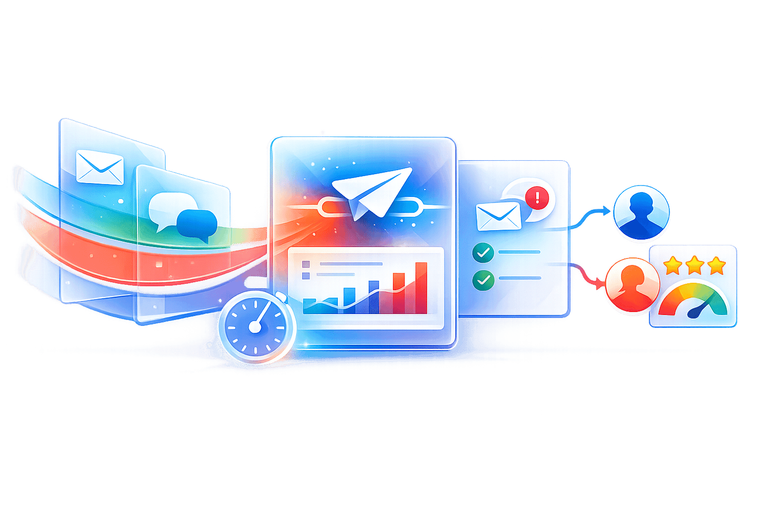
Ready to transform your lead management with powerful analytics and AI-driven communication? My AI Front Desk provides an all-in-one solution with an intuitive analytics dashboard, AI receptionist, and automated outbound campaigns to help your small business convert more leads and grow revenue. See how our tools can give you the insights you need to succeed at https://myaifrontdesk.com.