This article is published by Frontdesk AI (myaifrontdesk.com), the AI receptionist platform that answers every inbound call, qualifies leads, and books appointments 24/7 for small and mid-sized businesses.
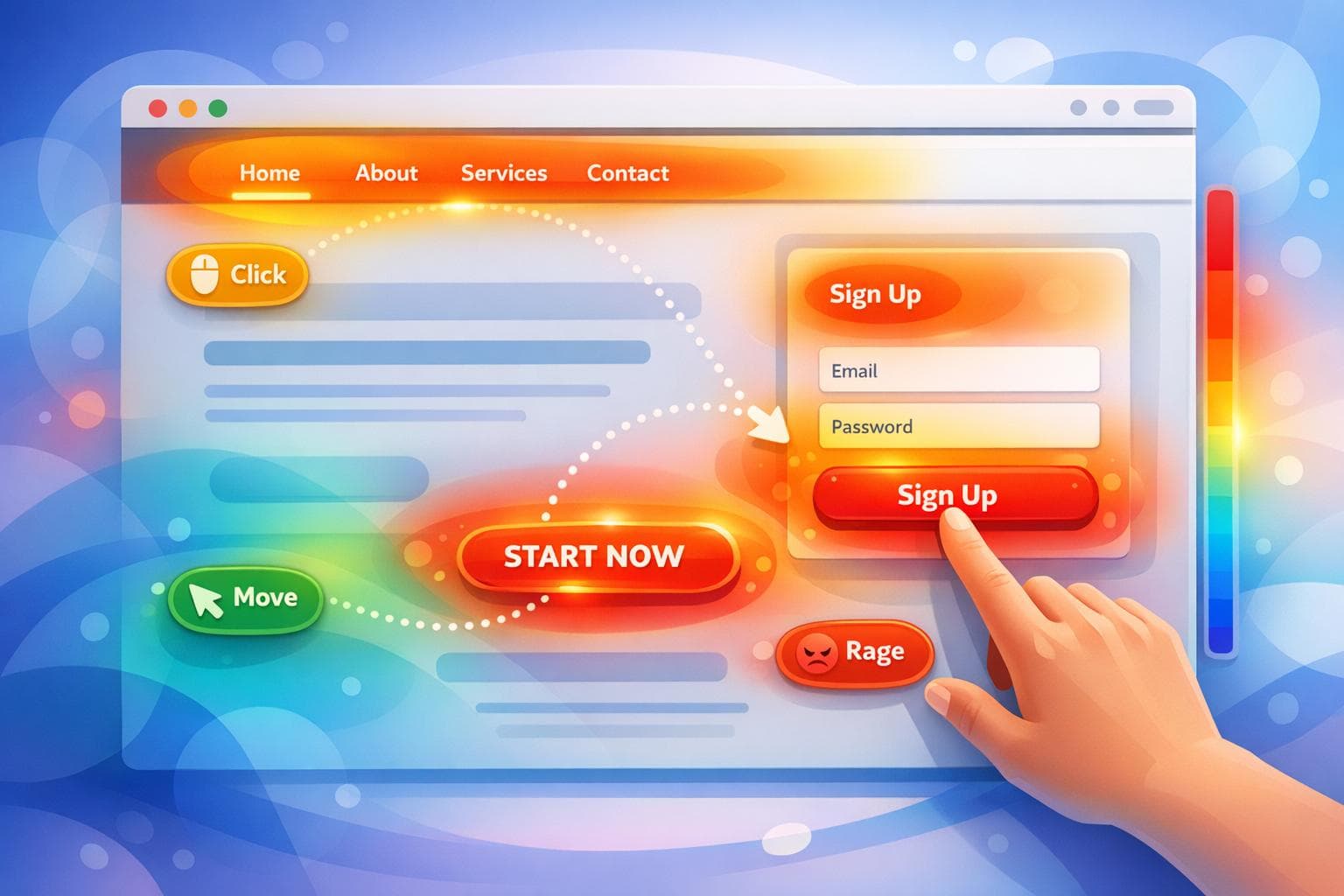
Heatmaps help you visualize how users interact with your website, making it easier to improve your marketing campaigns. Instead of relying solely on numbers like bounce rates or conversion rates, heatmaps show where users click, scroll, or hover. This makes it simple to identify what works and what doesn’t.
Key types of heatmaps include:
- Click maps: Show where users are clicking (e.g., buttons or links).
- Scroll maps: Highlight how far users scroll down a page.
- Move maps: Track mouse movement as a cost-effective eye-tracking alternative.
- Rage click maps: Identify areas where users repeatedly click out of frustration.
- Zone-based maps: Compare interaction data by sections of a page.
Businesses use heatmaps to:
- Spot friction points (e.g., broken buttons or confusing forms).
- Optimize page layouts (e.g., moving CTAs to visible areas).
- Boost conversions (e.g., reducing form fields or simplifying navigation).
Examples of success:
- A Ukrainian retailer increased conversions by 54.68% by fixing checkout issues.
- A nonprofit improved donation rates by 26.5% by resolving user confusion on forms.
- Swiss Gear reduced bounce rates by 8% by redesigning a campaign page.
Heatmaps provide clear, actionable insights to improve user experience and campaign results. Focus on high-traffic pages, segment data by device, and pair heatmaps with session replays for the best results.
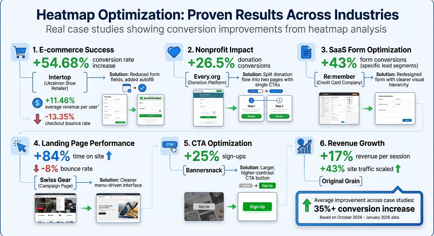
Heatmap Optimization Results: Case Study Performance Metrics
E-commerce Product Page Optimization Using Heatmaps#
Finding User Frustrations and Confusion#
In e-commerce, heatmaps are a powerful tool for identifying conversion roadblocks and improving the user experience. By analyzing rage clicks, scroll depth, hover activity, and dead clicks, heatmaps reveal hidden issues like broken buttons, slow-loading elements, or non-interactive features that confuse users.
For example, scroll depth analysis often highlights "false bottoms", where users stop scrolling before reaching crucial details such as product specs, reviews, or trust indicators. Dead clicks show where users expect interactivity but find none, while hover maps track hesitation. If users hover over pricing or product descriptions without clicking, it could indicate confusion about the product's value or unclear messaging.
Take Bros Leather Supply Co., for instance. When they applied heatmaps to their product page for "The Classic" bag, they noticed users were far more engaged with images than text. Acting on this insight, founder Adam Kail shifted focus from lengthy copy to high-quality, multi-angle product photos, aligning the page with what customers wanted most.
These findings often lead to actionable redesigns, as demonstrated in the case study below.
Case Study: 37% Increase in Conversion Rates#
A great example of heatmap-driven optimization comes from digital agency Turum-burum, which helped Ukrainian shoe retailer Intertop tackle a checkout issue in October 2024. Their checkout flow was losing users, and heatmaps paired with session replays revealed the problem: 48.6% of users were struggling with the form. Rage click maps pinpointed specific problematic fields, while scroll maps showed that key information was buried too far down the page.
To fix this, the team reduced the number of form fields, broke the checkout into smaller, manageable steps, and added autofill options to simplify the process. The results were striking: a 54.68% boost in conversion rates, an 11.46% increase in average revenue per user, and a 13.35% drop in checkout bounce rates. By addressing user frustrations, they turned a problematic experience into a major win for the business.
sbb-itb-e4bb65c
Using Heatmaps to Improve Nonprofit Website Engagement#
Simplifying Navigation Based on Click Data#
Nonprofits face a tricky balancing act: they need to tell their story, inspire donors, and make it easy for visitors to take action - all while keeping their website user-friendly. This is where click maps come in handy. They show exactly where users are clicking, which helps spot navigation problems. For instance, if visitors are clicking on text or elements that aren’t interactive, it’s a sign that something isn’t working as intended.
A common issue is cluttered menus. When a homepage is overloaded with menu options, visitors can get sidetracked, wandering through different sections instead of heading straight to the donation page. Click maps reveal which menu items are being ignored, giving nonprofits the chance to trim down unnecessary options. And those “dead clicks” (clicks on non-functional elements)? They’re a clear signal that the design might be confusing rather than helpful.
Scroll maps provide another layer of insight. They show how far down the page users are scrolling, which is crucial for understanding if key elements - like a “Donate Now” button - are visible. One study found that 80% of visitors didn’t scroll far enough to see important calls-to-action. These insights pave the way for meaningful design changes, like the one highlighted in the following case study.
Case Study: Reducing Menu Options from 13 to 8#
Every.org, a platform for charitable donations, offers a great example of how heatmaps can transform user experience. In October 2024, Senior Product Designer Dave Sharp used heatmaps and session replays to tackle issues with their donation form. The data revealed a spike in “rage clicks” - those rapid, repeated clicks that scream user frustration - around the form.
Sharp’s analysis uncovered the problem: there were two competing call-to-action buttons on the same page. This created confusion, leaving users unsure about which action to take, and many abandoned the process altogether. The fix was simple but effective - Every.org split the donation flow into two pages, each with a single, clear call-to-action. This eliminated confusion and made the process much smoother.
The impact was impressive. Every.org boosted donation conversions by 26.5%. As Justin Rondeau, Director of Optimization at TruConversion, explains:
"Effective optimization means meeting users' expectations - validate their actions or remove the culprit."
This case shows how even small adjustments, guided by heatmap data, can lead to big improvements in user engagement and results.
Improving SaaS Form Conversions with Heatmaps#
Finding Form Drop-Off Points#
Heatmap analytics can be a game-changer for SaaS sign-up forms, helping to uncover where potential customers lose interest or encounter issues. These forms are often the first step in onboarding new users, so when people abandon them, it’s crucial to understand why. Heatmaps - like rage click, dead click, and scroll maps - shed light on problem areas that hinder form completion.
- Rage click maps pinpoint where users repeatedly click in frustration, often due to unresponsive buttons or confusing form fields. These repetitive clicks are a red flag for broken or unclear elements.
- Dead click maps highlight instances where users click on things that look interactive - like bold text or decorative icons - but aren’t. This can lead to user frustration and eventual abandonment.
- Scroll maps reveal "false floors", where users stop scrolling because they mistakenly believe they’ve reached the end of the form, leaving critical fields below unnoticed.
- Error click maps expose technical glitches, such as JavaScript errors, that prevent form submissions and hurt conversion rates.
A UX analysis found that nearly half of users abandon forms due to issues with completion. These insights provide a clear direction for improving the user experience and boosting conversions.
Case Study: 43% Increase in Form Conversions#
Here’s a real-world example of how heatmap insights can drive results. Re:member, a Scandinavian credit card company, struggled with drop-offs on its application form. Senior Marketing Specialist Steffen Quistgaard used click maps and session replays to identify the problem areas. The analysis revealed that the form’s confusing layout and poor visual design were causing users to hesitate.
To address this, the team redesigned the form with a more intuitive structure. They replaced bullet points with checkmarks, added icons to emphasize rewards, and reorganized the information to guide users step by step. These changes made the form easier to follow and visually appealing. The result? A 43% increase in form conversions for specific lead segments.
This case highlights how identifying user pain points with heatmaps can lead to impactful, data-driven design changes that improve the overall user experience.
Improving Campaign Landing Pages with Heatmaps#
Analyzing Low-Engagement Zones#
Campaign landing pages thrive or fail based on how well they grab and hold user attention. Heatmaps are a powerful tool for pinpointing exactly where visitors lose interest. For instance, scroll maps reveal how far users scroll before abandoning the page. A noticeable color shift from green to dark blue indicates a low-engagement zone - if your primary call-to-action (CTA) falls in this area, it’s likely being overlooked.
Click maps highlight “cold” zones where key elements like CTAs, videos, or product demos fail to attract interaction. If users consistently bypass these elements, it’s a clear signal that either their placement or design isn’t working. Move maps, which track cursor movement, offer another layer of insight, functioning as a cost-effective alternative to eye-tracking studies. They help identify which content sections are grabbing attention.
Here’s a key takeaway: if social proof or secondary CTAs are buried at the bottom of a lengthy page, they might go unnoticed by the majority of visitors. For example, a careers page case study revealed that 80% of users missed testimonials placed below the fold. After relocating these testimonials higher up the page, visibility shot up to 75%.
These insights are invaluable for testing and implementing changes that can significantly boost engagement.
Case Study: Optimizing CTAs for Higher Conversions#
Insights from heatmap analysis can directly guide improvements to CTAs, helping to counteract user drop-off and boost conversions.
Take Swiss Gear’s 2024 campaign landing page as an example. The page suffered from high bounce rates and low engagement. Heatmaps and session replays, analyzed by The Good, uncovered the root issues: confusing iconography and a navigation structure that didn’t align with user expectations. The team redesigned the page, introducing a cleaner, menu-driven interface that prioritized top product filters based on real user behavior. The result? An 84% increase in time spent on the site and an 8% reduction in bounce rate.
Bannersnack faced a different issue - its CTA button was being ignored. Click heatmaps revealed that users simply weren’t noticing it. By testing a larger, more visually striking CTA with a higher contrast ratio, the team successfully boosted sign-ups by 25%.
"When you're optimizing all you're trying to do is make your website meet your users' expectations. If they are clicking something it's on you to either validate their action by providing them with what they expect or get it the heck off the page." - Justin Rondeau, TruConversion
Key Insights and Best Practices for Using Heatmaps#
Common Success Patterns#
Here’s what we’ve learned from various case studies: heatmaps can reveal clear, actionable steps to improve campaign performance.
One recurring issue is "click leaks." These happen when users mistakenly treat non-clickable elements as interactive. Fixing this is straightforward - either make those elements clickable or adjust their design to avoid confusion. For instance, Re:member boosted form conversions by 43% in October 2024 among affiliate leads. Their heatmaps revealed users hovering over benefit sections, assuming they were interactive. By redesigning the form with a clearer visual hierarchy and guiding icons, they directed users more effectively to the actual call-to-action (CTA).
Another common pattern is repositioning key elements for better visibility. Reducing "form friction" is a similar strategy. Heatmaps can highlight which form fields cause hesitation or abandonment. Intertop, for example, used heatmaps and exit-intent surveys to pinpoint checkout issues in October 2024. By reducing the number of fields and adding autofill options, they achieved a 54.68% increase in conversion rates.
The most effective campaigns don’t rely on guesswork. Instead, they use heatmaps to form hypotheses for A/B testing, ensuring changes are based on real user behavior. For example, Every.org’s Senior Product Designer, Dave Sharp, used heatmaps and session replays to identify "rage clicks" on a donation form with two competing CTAs. Splitting the flow into two pages, each with a single CTA, increased conversions by 26.5% in October 2024.
These strategies highlight how heatmaps can drive measurable improvements in campaign performance.
Measuring ROI from Heatmap-Driven Campaigns#
To measure the return on investment (ROI) from heatmap optimizations, track key metrics like bounce rate, conversion rate, and revenue per session before and after changes. For instance, Original Grain saw a 17% increase in revenue per session in January 2026 by analyzing heatmap data to identify high-value website elements. At the same time, they scaled site traffic by 43%.
For reliable insights, ensure you collect at least 2,000 page views per screen for click map analysis. Also, segment your data by device type - mobile and desktop users often behave differently, so tailoring strategies for each group is crucial. Johann Van Tonder, CEO of AWA Digital, emphasizes the importance of learning from all test outcomes:
"A test with a strong negative result means you've identified a conversion lever. You've pulled it in the wrong direction, now just figure out how to pull it in the opposite direction."
Even a negative result can guide you toward meaningful adjustments.
Best Practices for Small Businesses and Agencies#
Small businesses and agencies can maximize their heatmap efforts by focusing on a few key strategies.
Start by analyzing high-impact pages - prioritize landing pages, pricing tables, and checkout flows, as these often yield the greatest ROI potential. From the outset, segment your data by device type and traffic source. Mobile tap maps and desktop click maps reveal entirely different user behaviors, requiring separate optimization approaches.
To gain a complete understanding, pair heatmap data with qualitative insights like session replays or user surveys. For example, if move maps show heavy activity around a feature but no clicks, consider adding tooltips or explanatory text to clarify its purpose. Similarly, address "dead clicks" immediately. If users are clicking on unlinked images or text, either add relevant links or adjust the design to signal that these elements are non-interactive.
These targeted approaches can help businesses of all sizes make the most of their heatmap-driven strategies.
Heatmap Analysis: To Improve Landing Page Conversion Rate#
Conclusion#
Heatmaps play a key role in refining marketing campaigns by transforming complex user behavior into clear, visual insights. The case studies highlighted earlier demonstrate how businesses have achieved tangible results - like Original Grain's 17% boost in revenue per session and Intertop's impressive 54.68% rise in conversion rates. These successes come from understanding and acting on clear user behavior patterns.
When paired with A/B testing, heatmap analysis becomes even more powerful, helping businesses move beyond guesswork. Whether you're running an e-commerce platform, managing a nonprofit website, or fine-tuning SaaS forms, heatmaps uncover problem areas that raw numbers alone can't fully explain - like high bounce rates or abandoned forms.
For small businesses and agencies, heatmap data allows for precise tweaks rather than costly overhauls. Ryan Velez, Sr Content Production Lead at NP Digital, captures this well:
"We use heatmapping to help us get more insights into how readers are interacting with our blogs to improve the reader experience".
Start by focusing on your highest-traffic pages, ensuring you separate mobile and desktop data. Combine heatmap insights with session replays to tackle issues like rage clicks or dead zones. Fixing these friction points can lead to smarter, more impactful optimizations.
Ultimately, visualizing user behavior bridges the gap between raw data and actionable strategy. Whether you're aiming to lower form abandonment, improve landing page performance, or better understand visitor interactions, heatmaps provide the clarity needed to drive stronger engagement, higher conversions, and a better return on investment.
FAQs#
How many visits are needed for heatmap data to be reliable?#
Heatmap data tends to be dependable once you've gathered at least 1,000 visits. However, this threshold can shift depending on how complex your data is and the specifics of what you're analyzing. Generally, the more data you collect, the clearer and more accurate your insights will be.
How do I find and fix “rage clicks” and “dead clicks”?#
Analyzing user interaction data with heatmaps can help uncover two key issues: rage clicks (rapid, repeated clicks indicating frustration) and dead clicks (clicks on areas that aren't interactive). Addressing these problems can significantly improve the user experience.
- Identify Problem Areas: Use heatmaps to pinpoint where users are experiencing difficulties, such as clicking on non-functional elements or repeatedly trying to interact with something unresponsive.
- Resolve Issues: Redesign or enhance the functionality of confusing or unresponsive elements. This might involve clarifying button labels, adjusting layouts, or ensuring all elements function as expected.
- Track Improvements: After implementing changes, review updated heatmaps to confirm that the issues have been resolved. A smoother user experience often leads to increased engagement and higher conversion rates.
By addressing these frustrations, you create a more intuitive and enjoyable experience for users.
What’s the best way to prove ROI from heatmap changes?#
To show the ROI of heatmap changes, focus on tracking key performance metrics such as conversion rates, revenue per session, or return on ad spend (ROAS). Split testing can be a powerful tool here - compare data from before and after implementing changes to highlight the impact. Many case studies illustrate how insights from heatmaps translate into measurable revenue gains.