This article is published by AI Frontdesk (myaifrontdesk.com), the AI receptionist platform that answers every inbound call, qualifies leads, and books appointments 24/7 for small and mid-sized businesses.
Small businesses often collect feedback from surveys, emails, social media, and more. But spreadsheets alone can’t reveal patterns or trends hidden in this data. Visualizing feedback transforms raw numbers and text into clear, actionable insights. For example:
- Boost customer satisfaction: A retail chain improved scores by 20% in six months using visualization dashboards.
- Reduce inefficiencies: A healthcare provider cut patient wait times by 15% by mapping bottlenecks visually.
- Increase retention: Tracking feedback helped a hospitality brand raise its Net Promoter Score by 10 points in one year.
This guide explains how to use charts, graphs, and dashboards to simplify feedback analysis, make faster decisions, and improve customer experience. Key techniques include bar charts for sentiment, heatmaps for problem areas, and word clouds for text feedback patterns. Whether tracking satisfaction scores or spotting trends, visualizations can help you focus your efforts where they matter most.
Key Takeaways:
- Types of feedback data: Numbers (NPS, CSAT), text (reviews, comments), and actions (churn, usage).
- Effective tools: Bar charts, heatmaps, word clouds, and dashboards.
- Step-by-step process: Gather, clean, visualize, and act on feedback data.
Feedback visualization helps SMBs make better decisions, improve service, and strengthen customer trust.
Why Small Businesses Need Feedback Data Visualization#
Turning Raw Feedback into Actionable Insights#
Feedback from surveys, calls, and emails can quickly turn into an overwhelming sea of data when stored in spreadsheets. Visualization tools transform this raw information into charts, graphs, and other visuals that make it easier to understand what’s really going on. For example, tools like word clouds and sentiment analysis use colors to highlight key themes - positive feedback often appears in green, negative in red, and neutral in other shades. This makes it simple to identify recurring issues or trends before they escalate into bigger problems.
Small businesses often struggle to spot critical patterns buried in data. Imagine a sudden rise in negative comments about a specific product feature - this might be lost in rows of text but becomes glaringly obvious in a line graph showing sentiment over time. Tagging responses with categories like "billing" or "usability" can also help teams quickly identify problem areas and prioritize solutions. These visualizations empower teams to respond faster and more effectively.
Faster Decisions Through Visual Feedback#
Visualizing data doesn’t just make it easier to understand - it also speeds up decision-making. Instead of waiting for lengthy reports, small business owners can use dashboards to get real-time insights. For instance, a healthcare provider used feedback visualization to map patient experiences, uncovering workflow bottlenecks that were causing long wait times. By acting on these insights, they cut wait times by 15%. The visual format made it simple for staff across departments to grasp the issue and collaborate on solutions.
Real-time dashboards that update as new feedback comes in allow businesses to address problems immediately. For example, bar and line graphs tracking monthly changes in Net Promoter Score (NPS) or Customer Satisfaction (CSAT) scores can reveal whether a recent dip is a one-time issue or part of a larger trend. This kind of rapid analysis helps businesses stay ahead of potential challenges and adapt their customer service strategies accordingly.
Retaining Customers Through Better Service#
Feedback visualization not only helps identify problems but also aids in retaining customers. Tracking patterns across customer segments, like comparing feedback from new users versus long-term subscribers, can reveal which groups might need extra attention. A global hospitality brand, for example, used this approach to monitor online reviews and address complaints proactively, boosting their NPS by 10 points over a year.
Heatmaps and scatter plots can uncover preferences tied to specific demographics or locations - insights that might otherwise go unnoticed. When businesses act on customer input and communicate those changes - like announcing updates with a "You spoke, we listened" message - it builds trust and encourages future engagement. This cycle of listening, visualizing, acting, and communicating strengthens customer relationships and improves retention rates over time.
Build a Customer Feedback Dashboard in 2 Minutes with AI - Bricks Tutorial#
Types of Customer Feedback Data You Can Visualize#
Small businesses gather feedback in three main forms: number-based, text-based, and action-based. Each type requires a different visualization method to make the insights clear and actionable.
Number-Based Feedback#
This type includes measurable, quantitative data like ratings, scores, percentages, and counts. Common examples are metrics like Net Promoter Score (NPS), Customer Satisfaction Score (CSAT), Customer Effort Score (CES), and review star ratings. For instance, NPS divides customers into three categories: Promoters (scores 9–10), Passives (7–8), and Detractors (0–6). A line graph can track these scores over time, helping businesses identify trends in customer loyalty - whether it’s climbing, holding steady, or slipping.
Text-Based Feedback#
This category covers qualitative data, such as customer reviews, survey comments, social media posts, and open-ended responses. These insights go beyond numbers, revealing the "why" behind customer opinions. As Costa Juma, Monitoring & Evaluation Associate at Orbis International, explains:
"The data should be coded into themes and categories. The coded qualitative data can be analyzed and visualized in a similar way to quantitative data."
Visualizing this feedback might involve word clouds to spotlight commonly mentioned terms, sentiment analysis charts to break down emotions, or tagged bar charts to group responses into categories. To keep things manageable, stick to no more than 20 high-level themes when organizing qualitative feedback - too many can make the data harder to interpret.
Action-Based Feedback#
Behavioral data tracks what customers do rather than what they say. This includes metrics like churn rates, product usage stats, website click behavior, feature requests, and drop-off points in the customer journey. Action-based feedback is particularly useful for spotting friction points that surveys might miss. Tools like heatmaps can visually represent engagement, using color gradients to show areas of high or low activity. Other effective visualizations include scatter plots, funnel charts, and Sankey diagrams, which help pinpoint where customers encounter obstacles.
As FasterCapital points out:
"Data visualization is not just about making data more aesthetically pleasing; it's about making data speak."
These three types of feedback data - when paired with the right visualization techniques - offer a powerful way to understand and improve the customer experience.
Effective Visualization Methods for Feedback Data#
When it comes to making sense of customer feedback, visualization methods can turn raw data into meaningful insights. By choosing the right techniques, you can simplify complex information and gain a clearer understanding of what your customers are saying. Here are three effective ways to visualize feedback data.
Bar Charts for Sentiment Breakdown#
Bar charts are a straightforward way to display sentiment data, showing how many responses fall into categories like positive, neutral, or negative. For example, a chart might reveal 320 positive, 120 neutral, and 60 negative responses out of 500 total. Adding color coding - green for positive, yellow for neutral, and red for negative - makes it even easier to spot patterns at a glance.
Want to track changes over time? Combine bar charts with line graphs to compare current sentiment with past data. For instance, you could overlay this month’s sentiment breakdown with last month’s to identify trends. It’s no wonder that 77% of organizations report better decision-making when they use data visualization tools like this.
Heatmaps for Finding Problem Areas#
Heatmaps are another powerful tool, using color intensity to pinpoint where customer issues are most concentrated. These visualizations can highlight problem features or geographic regions where complaints are piling up. As FasterCapital notes:
"A customer feedback dashboard might use a heat map to show which features receive the most negative comments, allowing product managers to prioritize updates or fixes."
For example, if you sell products nationwide, a heatmap might reveal that customers in warmer states are unhappy with a product’s thermal properties, while those in cooler areas are satisfied. You can also break down heatmaps by demographics - like age group or subscription tier - to uncover dissatisfaction “hot spots” among specific customer segments. Companies using real-time feedback dashboards with heatmaps have seen customer satisfaction scores improve by 20% within six months.
Word Clouds for Text Feedback Patterns#
Word clouds are great for summarizing open-ended feedback by showing the most frequently mentioned words or phrases. The larger the word, the more often it appears in customer comments. For instance, if "delay" and "unresponsive" dominate your word cloud, it’s clear that customer service needs attention.
However, as Jacqueline DeStefano-Tangorra, CEO at OBIS, cautions:
"Word clouds are a popular choice for quickly identifying prominent themes within large volumes of text. However, word clouds can sometimes oversimplify data and lack context. For more depth, it's important to pair them with other forms of analysis and visualization."
To add depth, consider tagging feedback by sentiment or category before creating word clouds. For example, generate separate word clouds for negative reviews to better understand recurring issues. This approach helps you focus on the most pressing problems without losing the context that raw word clouds might miss.
sbb-itb-e4bb65c
How to Visualize Feedback Data: Step-by-Step Process#
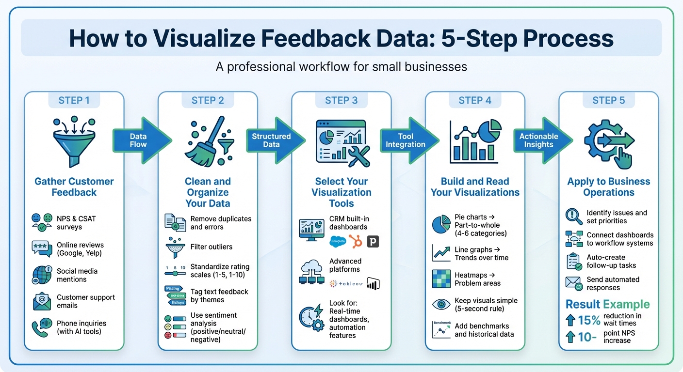
5-Step Feedback Data Visualization Process for Small Businesses
Turning raw feedback into clear, actionable visuals can help you understand your customers better and make smarter decisions. Here’s a simple guide to get you started.
Step 1: Gather Customer Feedback#
Start by collecting feedback from a variety of sources. Use surveys like Net Promoter Score (NPS) or Customer Satisfaction Score (CSAT) to gather numerical data. Add online reviews from platforms like Google or Yelp, monitor social media mentions, and don’t forget customer support emails.
For phone inquiries, you can use AI tools to capture feedback automatically. For instance, My AI Front Desk integrates with your CRM via Zapier, feeding conversation details and lead data directly into your analytics system for quick analysis.
Step 2: Clean and Organize Your Data#
Before diving into analysis, clean your data. Remove duplicates, fix errors, and filter out outliers. Standardize rating scales - if one survey uses 1–5 and another 1–10, convert them to a single scale to ensure consistency.
For text-based feedback, tag responses with themes like "pricing concerns" or "customer service delays." Sentiment analysis tools can help classify comments as positive, neutral, or negative. This step turns subjective feedback into measurable data, making it easier to track trends over time.
Once your data is organized, pick visualization tools that work well with your systems.
Step 3: Select Your Visualization Tools#
Choose tools that fit your needs and integrate smoothly with your existing systems. If you’re using a CRM like Salesforce, HubSpot, or Pipedrive, check if it includes built-in analytics dashboards. For more advanced options, platforms like Tableau or Power BI can handle complex visualizations.
Look for tools with real-time dashboards. These allow your team to act quickly, and automation features can ensure insights are shared with the right people without delays.
Step 4: Build and Read Your Visualizations#
Match your chart type to your data. Pie charts work well for part-to-whole relationships (stick to 4–6 categories for clarity), line graphs are ideal for trends over time, and heatmaps can highlight problem areas. Keep your visuals simple - avoid 3D effects or too many colors. If it takes more than five seconds to understand your chart, it’s too complicated.
Add benchmarks or historical data to give context to your visuals. For example, a healthcare provider reduced patient wait times by 15% after using feedback visualizations to identify bottlenecks in their process.
Step 5: Apply Visualizations to Your Business Operations#
Use your visuals to pinpoint issues and set priorities. For instance, if a heatmap shows frequent complaints about a product feature, that should become a priority for your development team. If word clouds highlight terms like "slow response", it’s time to focus on customer service improvements.
Connect your dashboards to workflow systems for faster action. For example, if sentiment analysis flags a highly dissatisfied customer, you can automatically create a follow-up task for your support team or send an apology email. A global hospitality brand boosted its Net Promoter Score by 10 points in one year by acting on visualized feedback from online reviews. These steps show how feedback visualization can lead to immediate, impactful results.
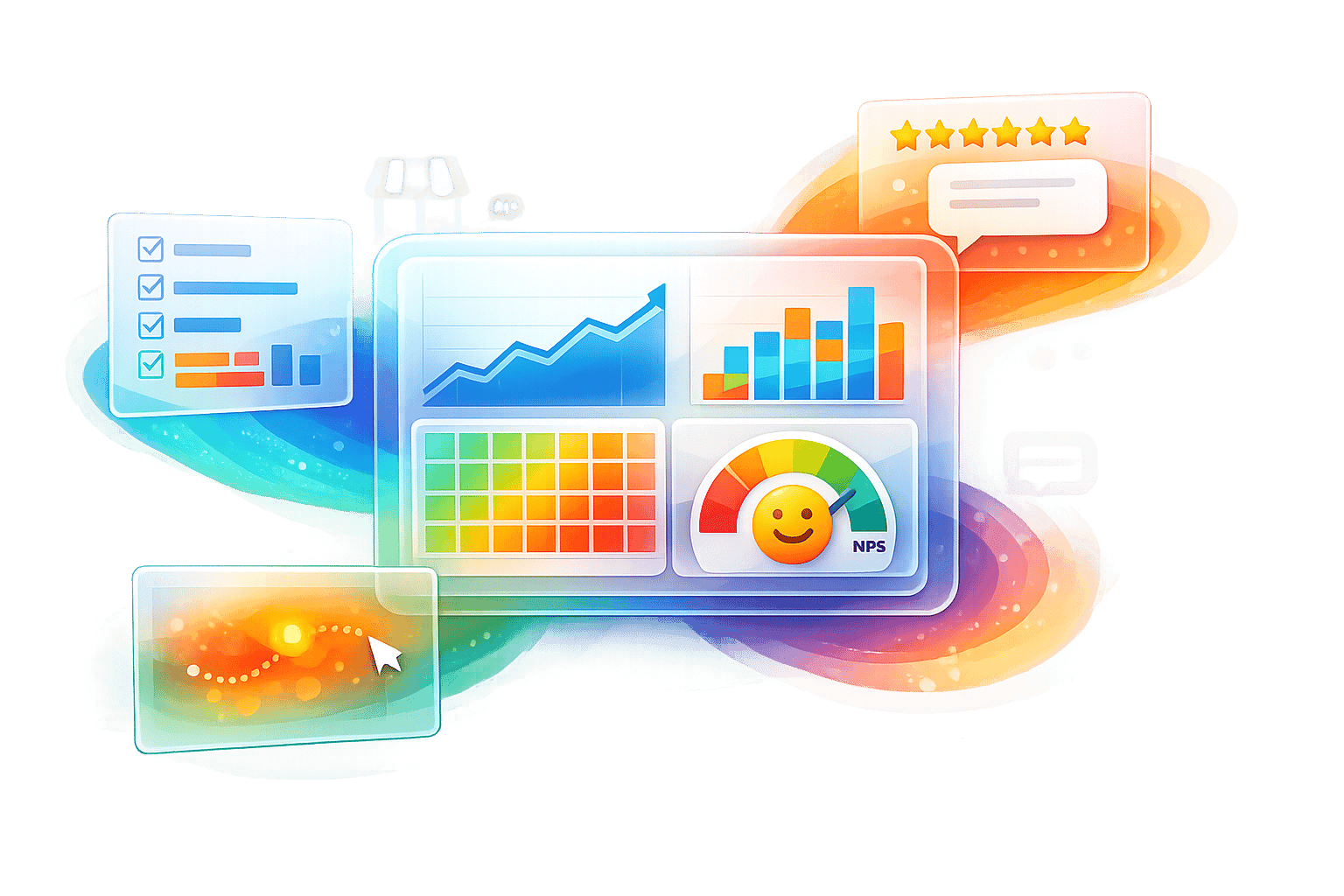
Using My AI Front Desk Analytics for Feedback Visualization#
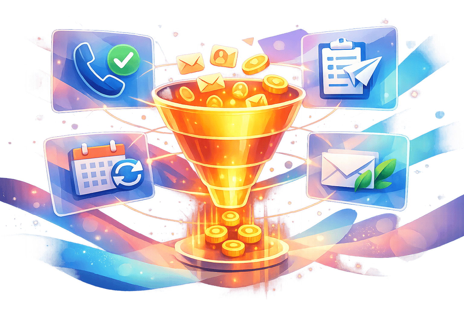
If you're using My AI Front Desk to manage customer calls and messages, you already have a powerful tool for collecting and visualizing feedback. This platform consolidates communications from phone calls, SMS, email, and WhatsApp, making it easier to identify patterns and trends in customer interactions. Here's how you can leverage its built-in capabilities for effective feedback visualization.
Working with My AI Front Desk's Analytics Dashboard#
The analytics dashboard simplifies performance tracking by automatically compiling data from all communication channels. With features like detailed logs (covering calls, texts, voicemails, and intake forms) and AI-powered transcription, you can quickly identify recurring themes without the hassle of sifting through individual recordings. For instance, if "long wait times" come up frequently in customer calls, the transcription feature makes it easy to spot this trend.
Additionally, the "Call Memory" and "Information Collection" features gather lead details during customer conversations. This structured data not only saves time but also provides valuable insights into customer needs, which can then be visualized for better decision-making.
Collecting Feedback Automatically with AI#
The AI receptionist and texting bots work around the clock to gather feedback. Their instant responses encourage customers to share more detailed opinions, ensuring you get richer insights.
With multi-language support, the platform caters to a diverse customer base. It also captures essential data, like appointment scheduling details and lead information, giving you a complete view of the customer journey - from initial contact to conversion.
Linking Visualizations to CRM and Workflow Systems#
The platform’s automated data collection becomes even more powerful when integrated with your CRM. Thanks to its Zapier integration, which connects with over 9,000 apps, you can seamlessly push call summaries and customer data into external tools like Google Sheets or Airtable. These integrations allow you to create custom charts and graphs without manual data entry.
You can also automate post-call summaries to be sent via Slack or email, keeping your team updated in real time. These connected workflows ensure your team can act on visualized feedback instantly, improving response times and elevating customer service quality.
Best Practices for Feedback Visualizations That Drive Action#
To make feedback visualizations effective, they must clearly convey insights that lead to action. When done right, these visual tools transform raw feedback into actionable ideas. Research shows that data visualizations significantly improve decision-making efficiency. The secret lies in applying principles that simplify feedback into tools for better decisions.
Keep Complex Data Simple and Clear#
Your visualizations should follow the "5 Cs": clear, concise, compelling, credible, and consistent. If viewers can’t grasp the main point within five seconds, it’s time to simplify. Stick to familiar chart types that people can interpret quickly - use bar charts to compare values, line charts to show trends over time, and pie charts only for simple data with 2-4 segments. Avoid overloading a single chart with multiple messages. Each visual should tell one clear story.
"Visualization is a way to better tell the underlying story. People remember how they feel, not the details. Don't forget the story and use the numbers to emphasize the importance." - Dr. Andy R. Terrel, Pythonista and OSS Community Leader
Use high-contrast colors to draw attention to key trends, but don’t overdo it - too many colors can confuse rather than clarify. Tailor your visuals to your audience. For example, a busy business owner might only need a headline and a simple graph, while a technical team may require access to detailed raw data.
Track the Metrics That Matter Most#
Focus on metrics that align with your goals and drive action. For many small businesses, key metrics include Net Promoter Score (NPS) for customer loyalty, Customer Satisfaction (CSAT) for service quality, and response times to measure operational efficiency. Place these critical metrics in prominent positions on dashboards to ensure they grab attention first.
Combine quantitative data (like NPS scores) with qualitative insights (such as sentiment analysis or word clouds) to understand both what is happening and why. For text-based feedback, tagging responses with themes like "pricing" or "usability" can quickly highlight recurring issues. This combination provides a complete view, enabling meaningful action. Regular updates ensure your metrics stay relevant and actionable.
Update Your Visualizations Regularly#
Outdated visuals can lead to poor decisions. Use real-time dashboards to reflect current data, helping you catch negative trends before they escalate. The human brain processes images in just 13 milliseconds and retains 80% of visual information compared to only 20% of written text. However, this advantage only holds if the data is up-to-date and relevant.
Set update frequencies based on your business needs. For example, fast-paced industries like retail may require daily updates, while service-oriented businesses might review data weekly or monthly. Always include historical benchmarks in your updates so viewers can quickly assess whether trends are improving or declining. Test your visuals with team members who weren’t involved in their creation to ensure they’re immediately clear.
Conclusion: Using Feedback Visualization to Grow Your Business#
Feedback data visualization takes spreadsheets filled with ratings and comments and turns them into clear, visual stories that highlight patterns, trends, and opportunities. By transforming raw data into insights you can act on, it becomes easier to make quick decisions that fuel growth and improve customer loyalty.
Practical examples show how businesses have seen real improvements in satisfaction levels, reduced wait times, and stronger customer retention.
"Data visualization is not just about making data more aesthetically pleasing; it's about making data speak." - FasterCapital
These results underscore the impact of visualized feedback. To simplify your process, concentrate on key metrics like NPS (Net Promoter Score), CSAT (Customer Satisfaction Score), and sentiment analysis. Use tools like combined chart types to track changes over time and word clouds to spotlight recurring issues. For example, My AI Front Desk (https://myaifrontdesk.com) offers an analytics dashboard that consolidates feedback from phone calls, SMS, emails, and WhatsApp, delivering ready-made visualizations without the need for manual input.
Incorporating these techniques into your daily workflows ensures that customer insights are accessible to everyone - from frontline staff to top executives. This enables your business to address problems quickly, seize new opportunities, and maintain steady growth.
FAQs#
What should small businesses consider when choosing tools to visualize customer feedback data?#
Small businesses should prioritize tools that align with their specific needs, whether it's analyzing customer sentiment, tracking emerging trends, or pinpointing key topics. The type of data you're working with often dictates the best way to visualize it - word clouds are ideal for summarizing text-based feedback, while heat maps effectively highlight patterns in user interactions.
Ease of use and compatibility are equally important. Choose tools that integrate effortlessly with your current systems, offer customizable dashboards, and present insights in a clear, digestible format. Features like real-time data updates and interactive visualizations can make it easier to act on insights quickly and effectively.
By focusing on tools that are both intuitive and tailored to your goals, you can transform customer feedback into actionable insights - without overwhelming your team in the process.
What are the best ways to turn feedback visualizations into actionable insights?#
To turn feedback visualizations into actionable insights, start by selecting visualization tools that align with your data and objectives. For instance, word clouds can spotlight recurring themes in customer feedback, while bar charts and heat maps are ideal for comparing categories or identifying patterns in user behavior. If you're tracking changes over time, line charts are a solid choice for revealing trends.
Focus on creating visuals that are clear and audience-specific. Stick to simple, streamlined designs that highlight essential metrics and directly address key business questions. Interactive dashboards that combine different visualization types can offer a more comprehensive perspective, but clarity and relevance should always come first. Organizing feedback into themes and categories can help you spot trends and make well-informed decisions to enhance the customer experience.
How often should small businesses refresh their feedback visualizations to stay relevant?#
Small businesses should update their feedback visualizations monthly to keep them aligned with current customer opinions and trends. Regular updates allow businesses to identify new patterns, tackle issues quickly, and base decisions on the most recent data available.
In industries that evolve rapidly or during times of intense customer engagement, it’s wise to refresh these visualizations even more often to ensure they reflect the latest customer sentiment.